
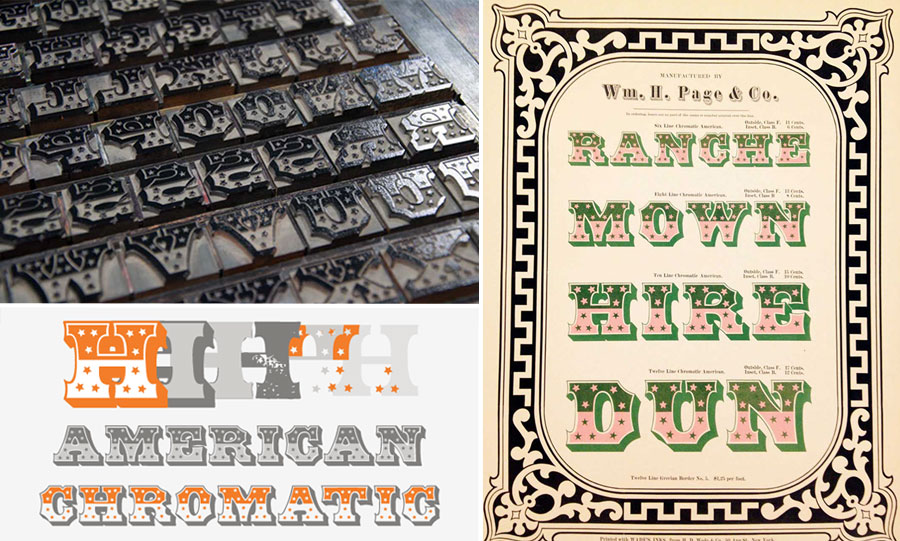
On Thursdays, we read reviews or news stories about art and study the language used to describe them. Learn about how the P22 Type Foundry and the Hamilton Wood Type & Printing Museum have been working together to revive the look of old wooden typefaces. See an example of Hamilton Wood Type’s American Chromatic below.
Here are three paragraphs of the article from Adobe Create Magazine:
QUIRKY ORIGINALS
Type designers at Hamilton (which is in Two Rivers, Wisconsin) weigh a number of considerations when deciding which typefaces are good candidates for digitization. Many of the ornate historical alphabets have a limited usefulness today, but others are more versatile.
Transforming a 100-year-old wooden typeface into a digital version that feels like the original is a complex undertaking. Richard Kegler, lead designer, founder of P22, and director of the Book Arts Center at Wells College in Aurora, NY, says, “If you only have five letters to start with, you have to imagine what the rest of the alphabet is going to look like, and there’s so much quirkiness in the original designs. Some of that is due to cross pollination between wood type manufacturers untrained as designers, who created letterforms by looking at sign painters’ reference books for inspiration, and the sign painters who referred back to printed wood type posters for inspiration and tried to emulate those styles. We look at as many historical printed specimens as possible and then work from at least one actual woodtype specimen as well, because having that actual physical piece of wood type helps in figuring out certain design aspects.”
So there’s a certain degree of interpretation at every step of the process. It’s worth noting that the issue is not unique to the world of wood type; in digital re-issues of early typefaces, such as the 16th-century’s Garamond, versions produced by different foundries (such as Adobe) all have their own idiosyncrasies that cause the hand of the maker to remain visible in the work.
The first paragraph of this section talks about the things that type designers think about when they decide which typefaces are the best to digitize. It mentions ornate historical alphabets, which means the old typefaces that have a lot of detail and might be difficult to read. Many of them are not very useful, but some are more practical.
In the second paragraph, the author describes the process of digitizing wooden type. In the first sentence, she says that changing a 100-year old typeface into a digital form that looks like the original is a complex undertaking, which means it takes many steps to complete. Next, there is a long quote by Richard Kegler. He talks about how you have to think about what the font will look like before you begin because the original typefaces have a lot of unusual details. He says that part of the reason for this is that there were many people involved in making these typefaces, such as wood type manufacturers, designers, and sign painters. Each group inspired each other, which is what he means by cross-pollination. They copied each other’s styles and so some of the typefaces became very detailed. In the last sentence, he says that when they digitize one of these old typefaces, they look at many printed examples from history and also use one wooden example as a reference to get the details right.
In the third paragraph, the author says that this process is similar whenever a foundry tries to digitize an old typeface – not just with wooden typefaces. She says there’s a certain degree of interpretation at every step of the process, which means that at every step, the designers have to decide how the typeface should look. She gives the example of Adobe Garamond, which is a very famous typeface that was digitized from 16th century metal type created by French printer Claude Garamond. When it was first digitized, different foundries created different versions of it, and you could see the style of the designer in each one.
I’ve chosen 5 words or phrases for you to focus on today. They are in bold. If you don’t know them, look up the meaning, synonyms, antonyms, and other forms of these words. You can find links to Merriam-Webster dictionary sites at the bottom of this page.
What do you think of this article? Which phrases do you like best? Do you have questions about the vocabulary? Do you want to suggest a review for me to discuss next week? Leave a comment below!
To read the original article, written for Adobe Create Magazine by Angela Riechers on December 27, 2017, click the link below:
https://create.adobe.com/2017/12/27/bringing_wood_type_i.html